

Brand ID + Art Direction
Concept work ahead of the branding of ten cities throughout Morocco. Launching SOon.
Moroccan National Tourist Office
Brand Design Creative Concepts
Forever Moving

This is a visual direction rooted in magic. Magic moving through generations of storytelling, blessings shared freely, meditations and spiritual moments inspired by infinite pattern and symbolism, a living representation of our concept, Forever Moving.
Visual Elements:
Color inspired by foods that improve baraka (blessings, genuine desire for success and good fortune of others)
Berber Warp Stripes, textiles
Layers
Rotation, movement
Infinite Rapport (patterns cut off)
Geometric Islamic Pattern
Tasir (straight lines, geometric)
Tawriq (natural)
Zellij Mosaic

Various elements of the graphic system.
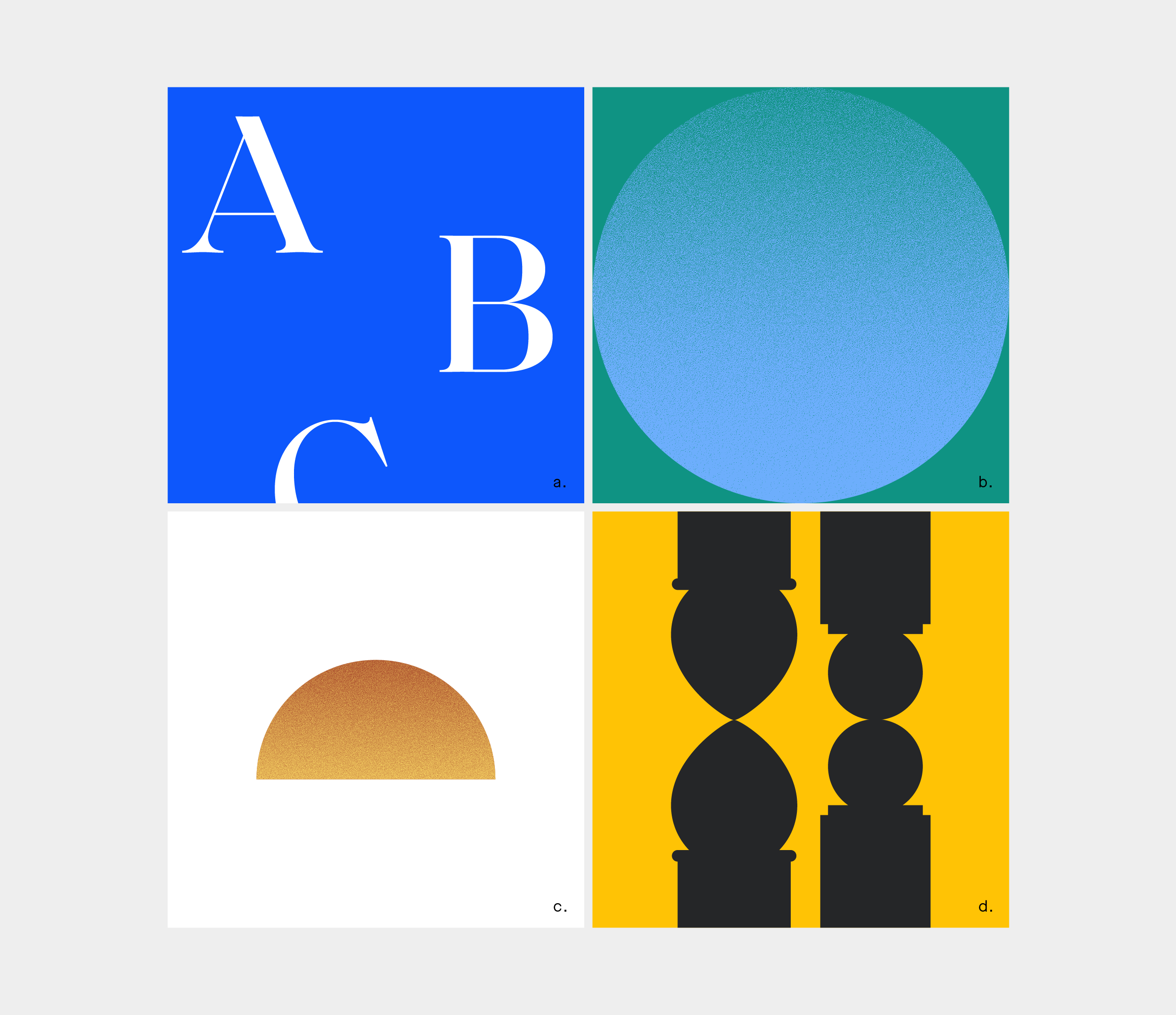
A. Vertical Line
Strong presence of vertical lines. The Berber aesthetic principally involves straight lines, and there is a belief that that warp (vertical) threads in a weaving are blessed. With this simple graphic, we weave a small but meaningful narrative of blessing into communications inviting travelers to experience Morocco.
b. Layering
Layouts always include elements of layering, an omnipresent representation of the many layers of the Moroccan culture and its coexistence of cultures, religions, and heritage. Cutouts act as a metaphoric window to the soul of the city when layered with photography.
C. Layout
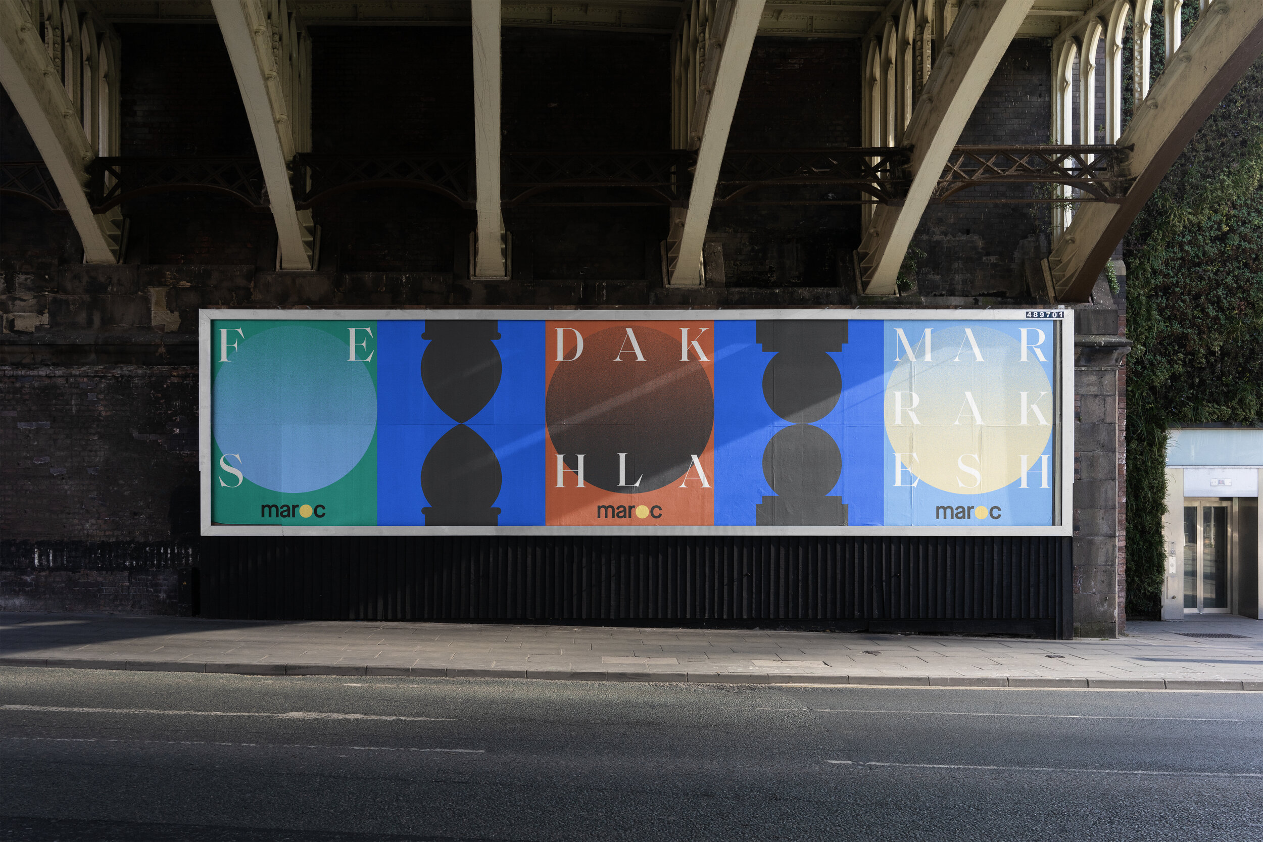
Tile shape can be used as a mechanism for page division, and infinite rapport is implemented when geometric designs are in use. This style of cutting off a pattern represents the eternal movement of a design, and is often seen in Moroccan rugs designed with talismans and meaningful symbols. This feature implies that in one’s imagination, a pattern (and therefore its blessing) moves outward and onward infinitely.
D. Pattern Library
Infinite Rapport represented in layouts where images and patterns are cut off on one edge.
Arabesque, Tasir (straight lines, geometric), Tawriq (natural), and Zellij Mosaic leveraged for distinct pattern.
Pattern in use is often positioned at the bottom of the page, in a similar fashion to where you would see Zellij tilework — the bottom half of a wall.
OOH
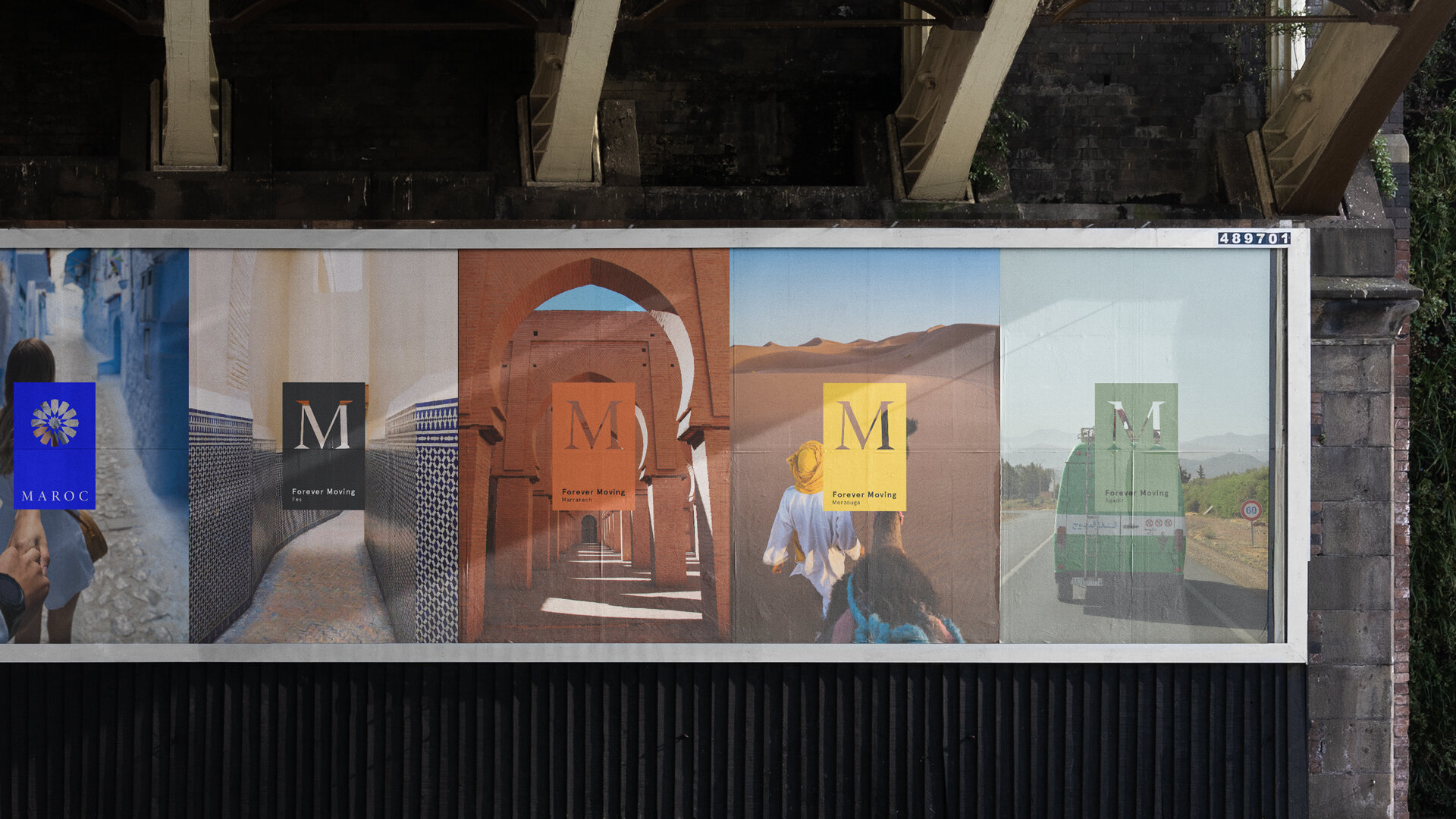
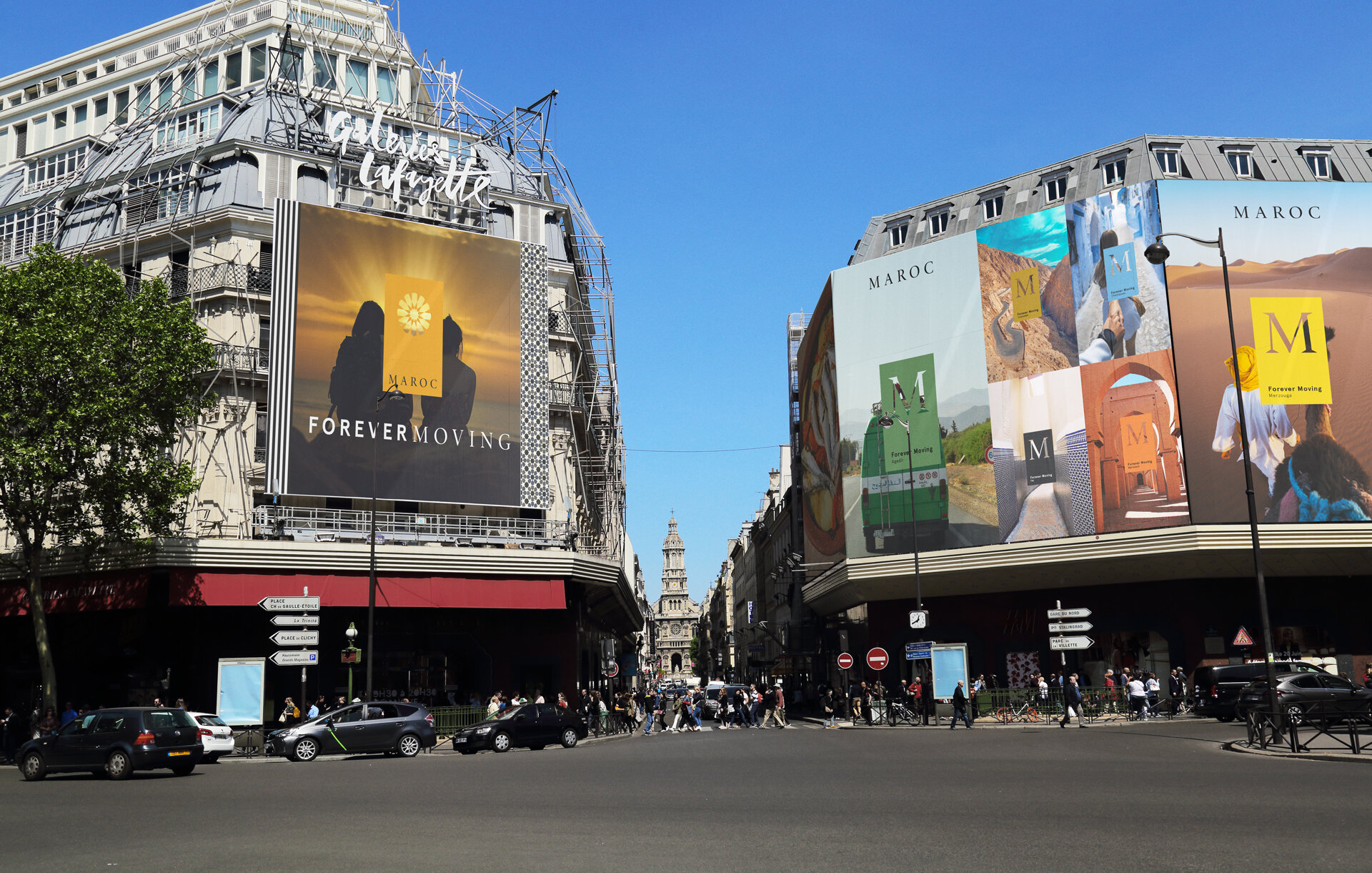
Global Design System


Branded by Destination


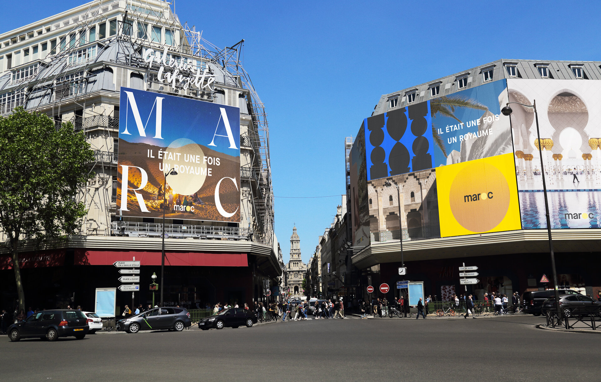
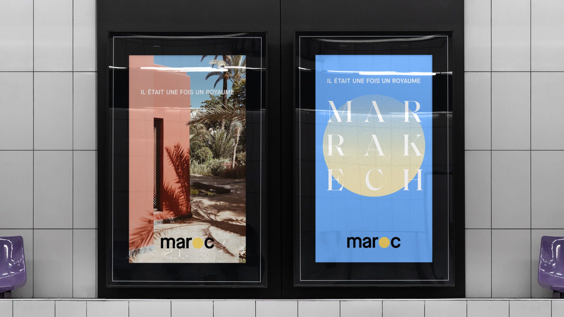
Once Upon a Kingdom
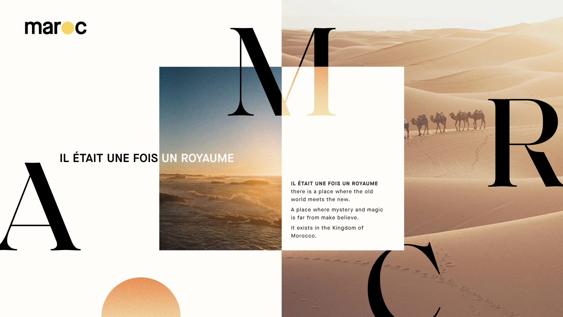
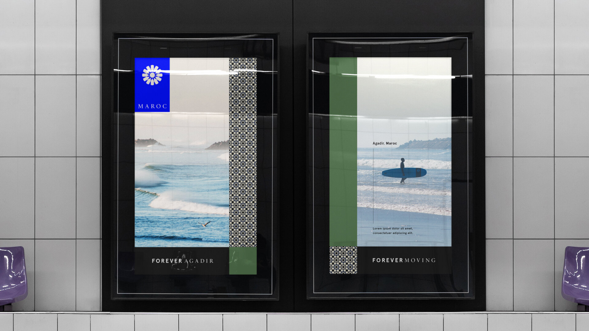
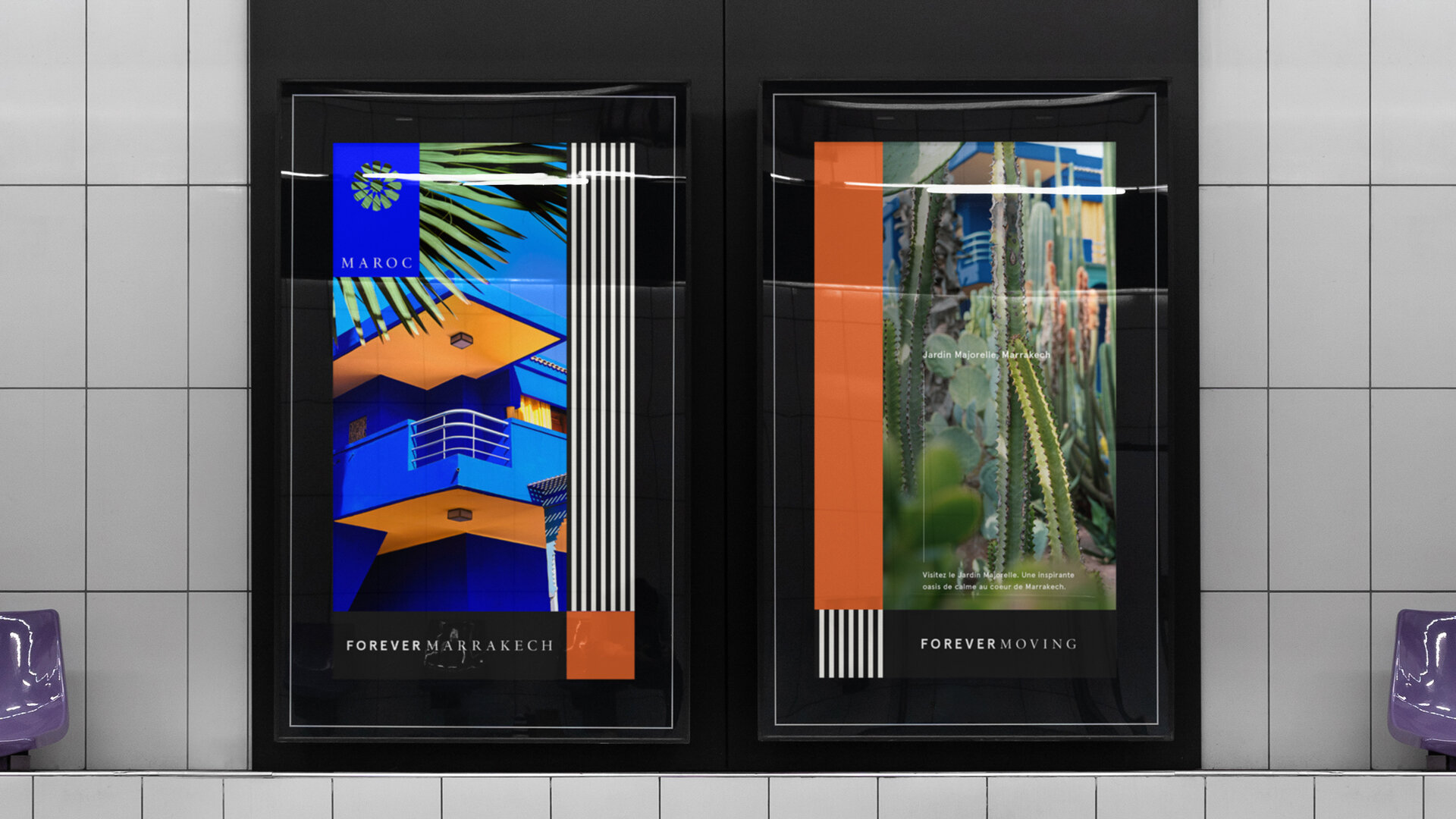
Around the world, storytelling has been linked to grand adventures taking place in exotic palaces and across diverse terrain, with great attention given to detailing the descriptions of these scenes. This identity track borrows from authors who travel far and wide seeking Morocco’s vast outdoor scenery and grand architecture for inspiration, also paying homage to these grand scenes as described in traditional Moroccan Hikayat (stories).
The system celebrates graphic, long shadows cast by the warm sun, starry nights and every grain of sand filling the seemingly endless desert dunes, waves crashing against the east and north coasts, and the snow kissed peaks of the Atlas Mountains. Through the use of color we represent transformation — as often seen in the hero at the heart of a story. He may begin as one thing, but emerges anew as the story closes. Likewise, color gradiates in sunset tones. Texture brings a subtle but dynamic element, emerging like sand blown across pages of a weathered book. Shape is graphic and geometric, with the circle acting as our hero, representing halca (listeners gathered around a storyteller), and the earthly wonder of the sun and the moon, under which all time passes, and storytelling occurs. The circle carries deep symbolic meaning across many cultures, universally representing notions of journey, eternity, unity, and wholeness.
Visual Elements:
Graphic Shadows
Graphic Shape
Gradient Color Change
Abstracted Arches
Grainy + Sandy Texture
White Space
Circle: Sun + Halca
Various elements of the graphic system.
A. Typography
Oversized typography makes a large impact and can be used with or without photography.
B. Gradient Sun
The gradient sun is a clean, graphic representation of the sun in the logo and can be layered and color coordinated by destination.
C. Placement and Position
Positioning of sun element can be played with as a symbolic passage of time, and for wayfinding throughout communications.
D. Shape
Strong architectural arches create bold graphics that can be paired with photography or used to pace content, acting as a place to rest the eye.
OOH
Global Design System


Branded by Destination


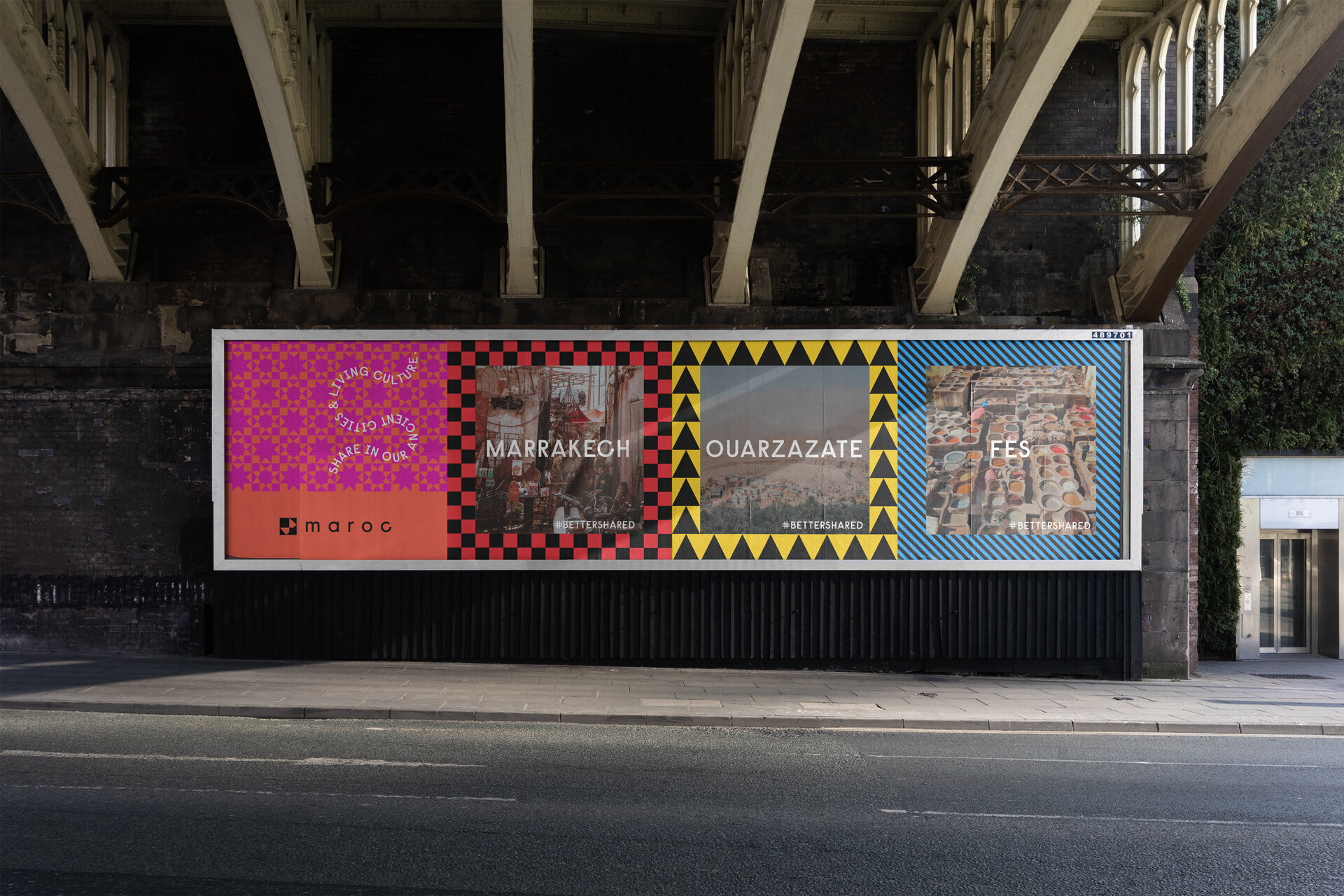
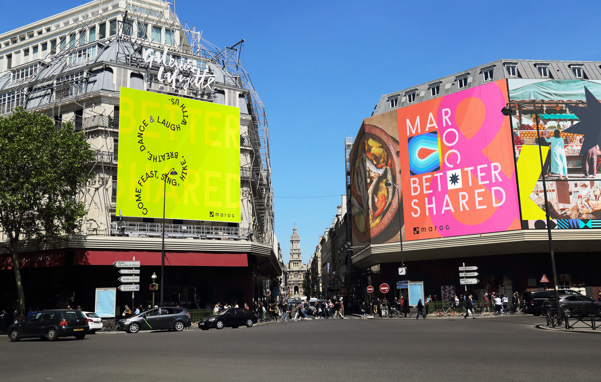
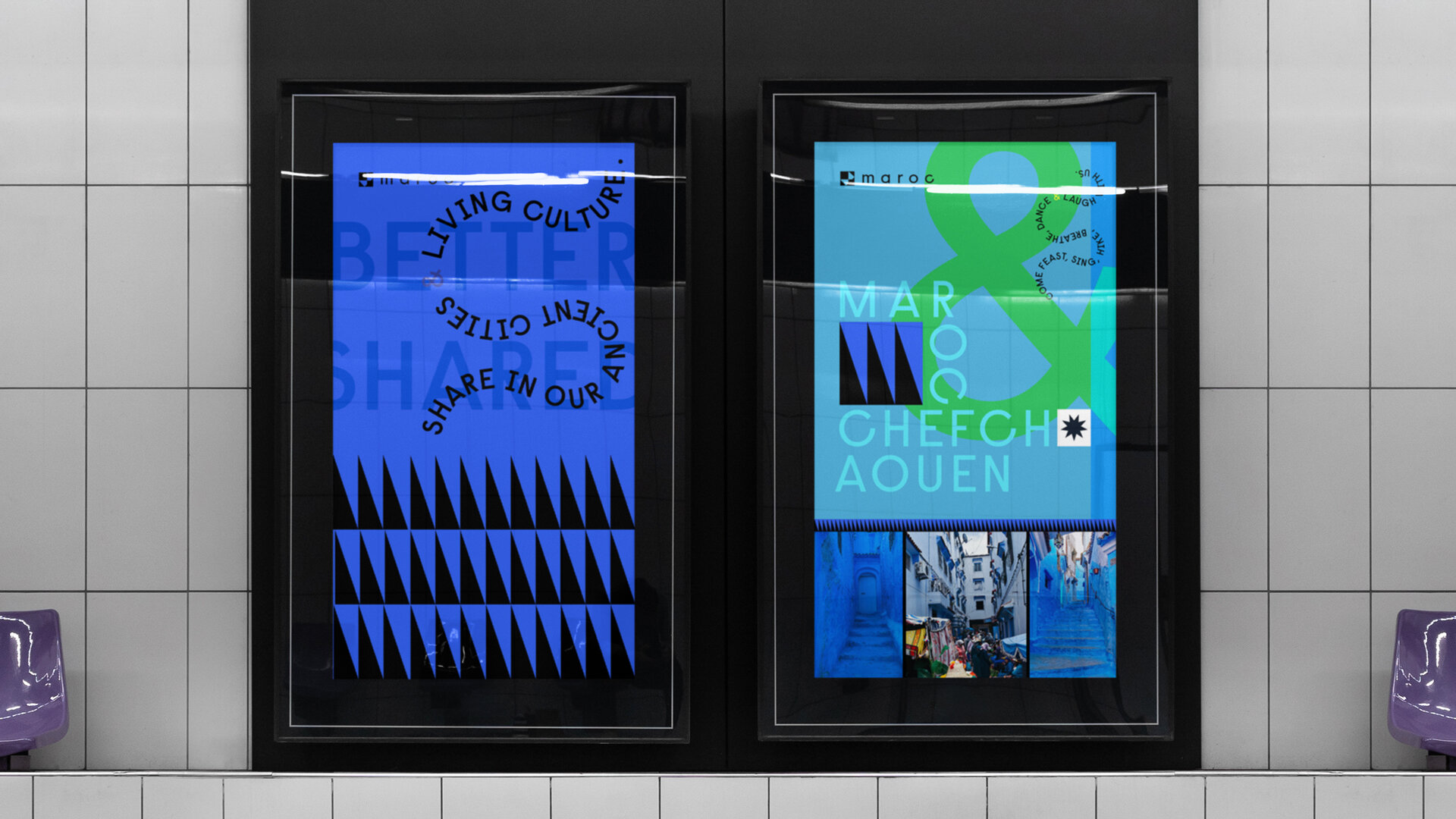
Better Shared

This direction is inspired by the endless exploration and wanderings possible in Morocco. Exploration to be shared amongst friends, old and new, in a kingdom where homes and hearts are open. A playful, happy palette of color inspired by Moroccan artists Hassan Hajjaj and Mohamed Melchiand, the bold system shouts joyfully, celebrating the one of a kind vibrance found in Morocco. There is a discovery of self when greeted with the culture of this country, and Better Shared aims to capture that spark. Leveraging patterns that are abstracted and bold (as opposed to the ultra luxurious zellij mosaics), patterns are simple geometric, accessible and energetic. This direction speaks to the hospitable nature of the Morocco’s people, referencing more common, simple design.
Visual Elements:
Wavy Lines
Meandering text
Hard Edge Painting
Mix and Match
Graphic Pattern
Borders
Abstracted shape

Various elements of the graphic system.
A. Ampersand
The ampersand represents sharing and is a graphic visualization that brings images, people, etc. together, and can be leveraged in copy.
b. Pattern Library
Pattern library and borders liven up designs and can be paired with photography.
c. Logomark
Mark (from logo) creates a repeating pattern that can be used to brand various materials.
d. Meandering Type
Wandering type is a playful way to communicate various messaging around shared experiences.
OOH
Global Design System


Branded by Destination


three unique Creative Territories, MNTO Brand Design of destinations
Concept work and brand design that would eventually lead to the branding of ten cities throughout Morocco. Launching SOon.
Brand design, LOGO, MARKS, GRAPHIC SYSTEM, COLOR, TYPOGRAPHY
CREATIVE DIRECTOR: REMI CARLIOZ