

Brand ID + Art Direction
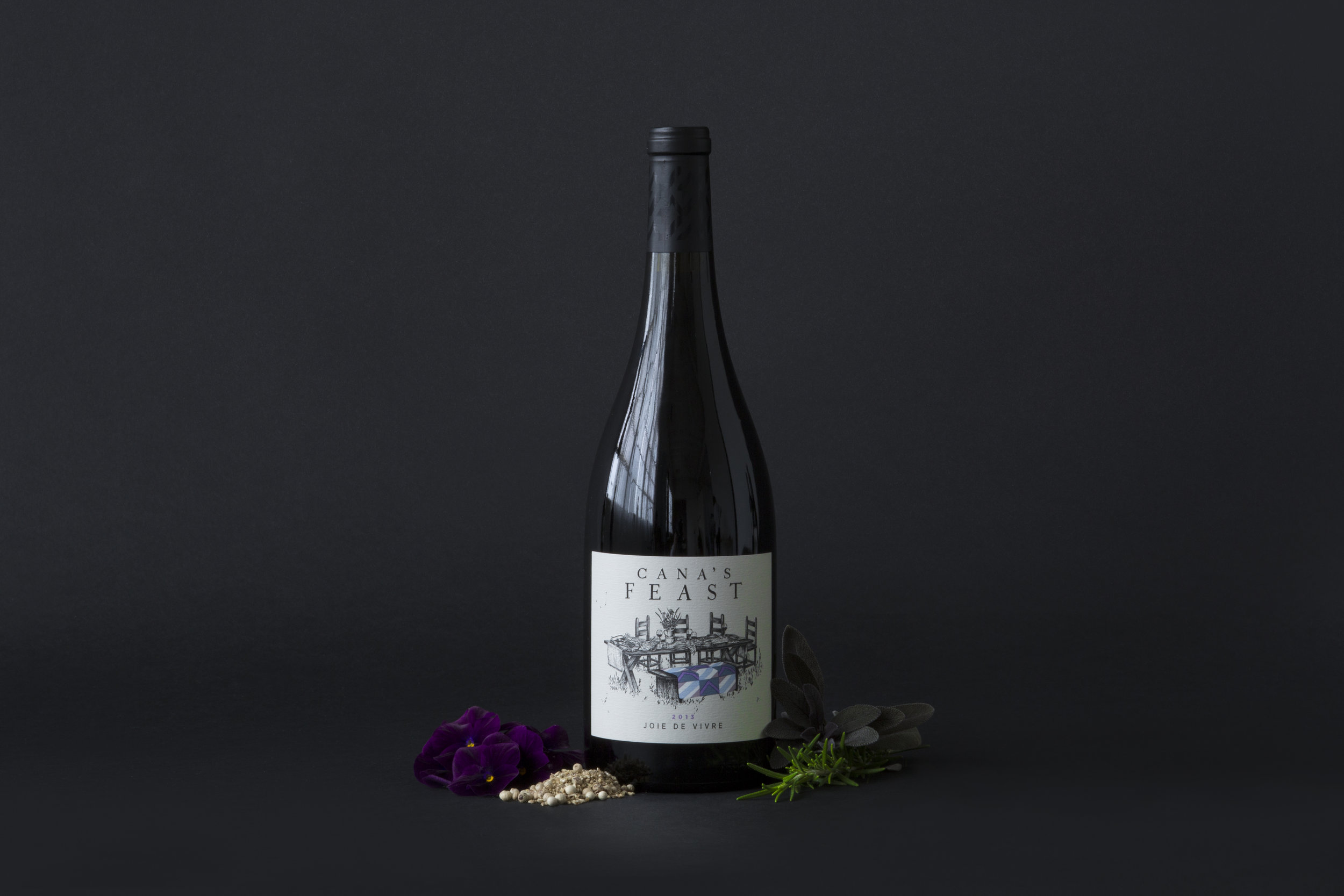
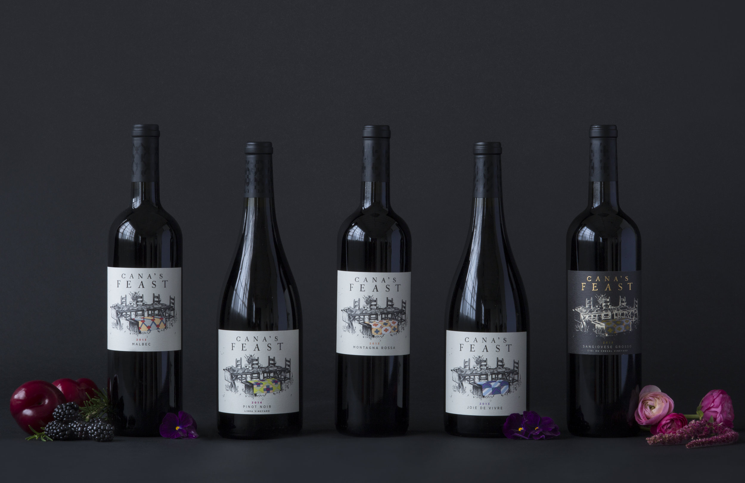
Cana's Feast Winery
Identity & Label Design


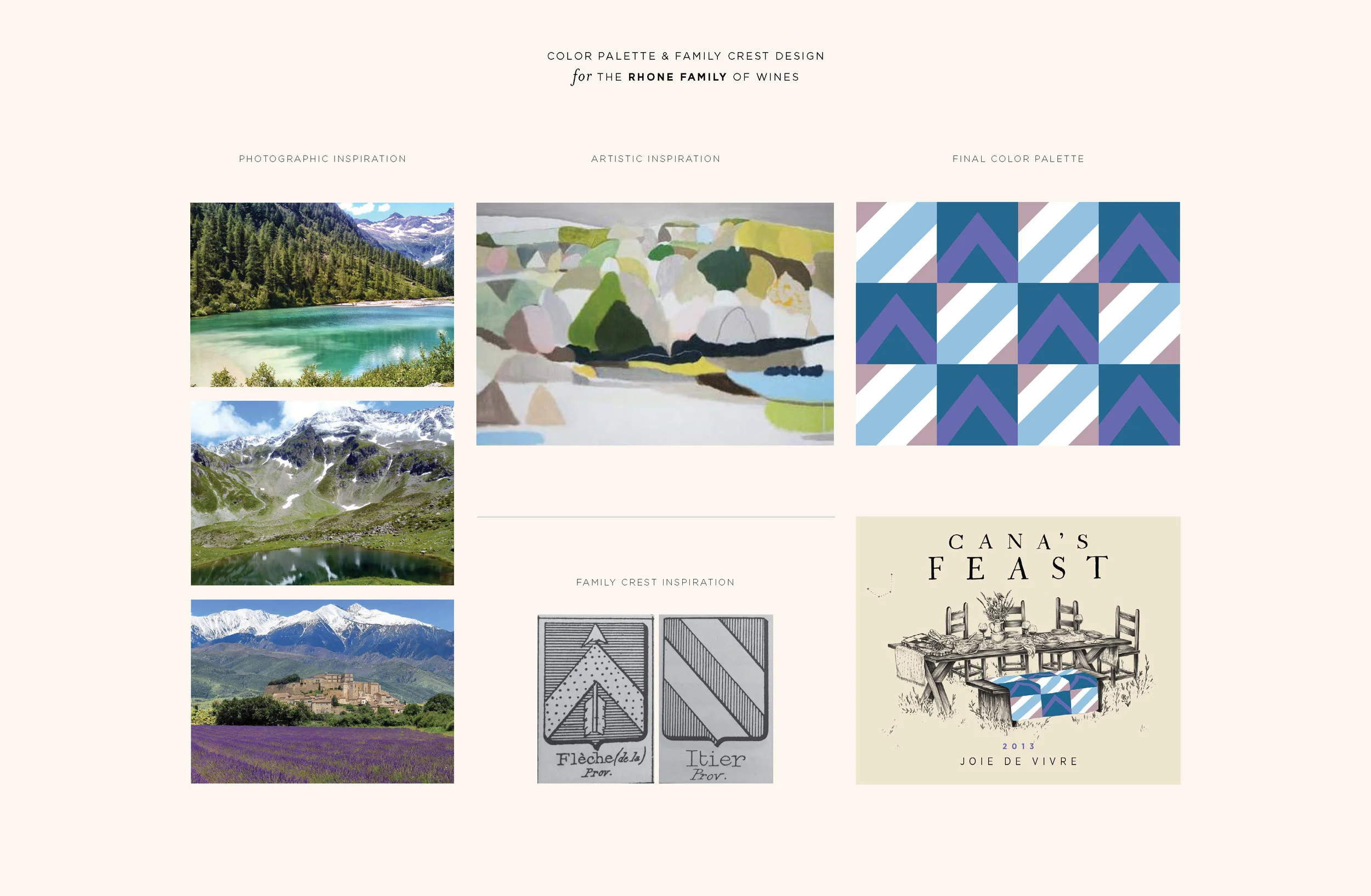
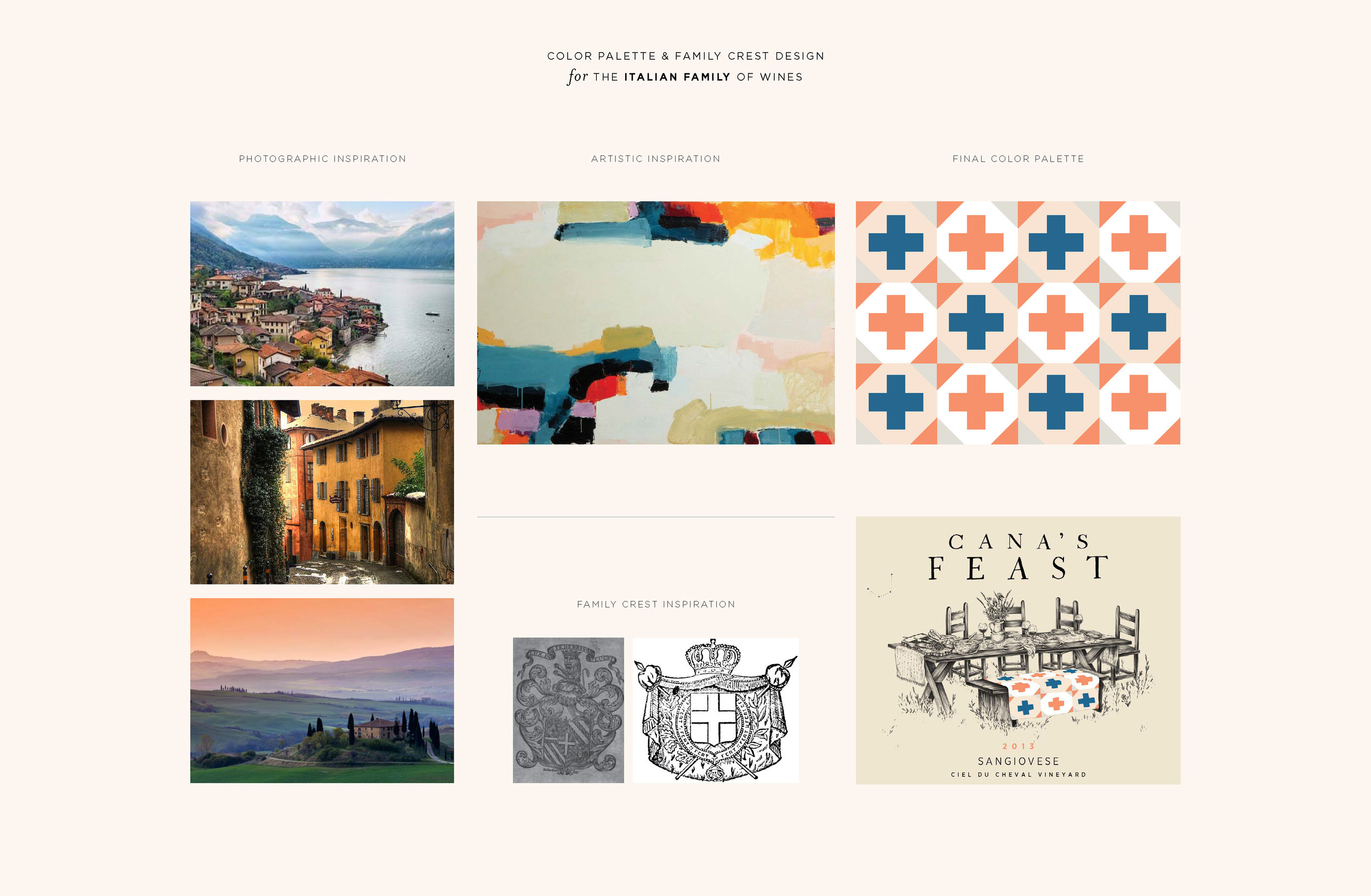
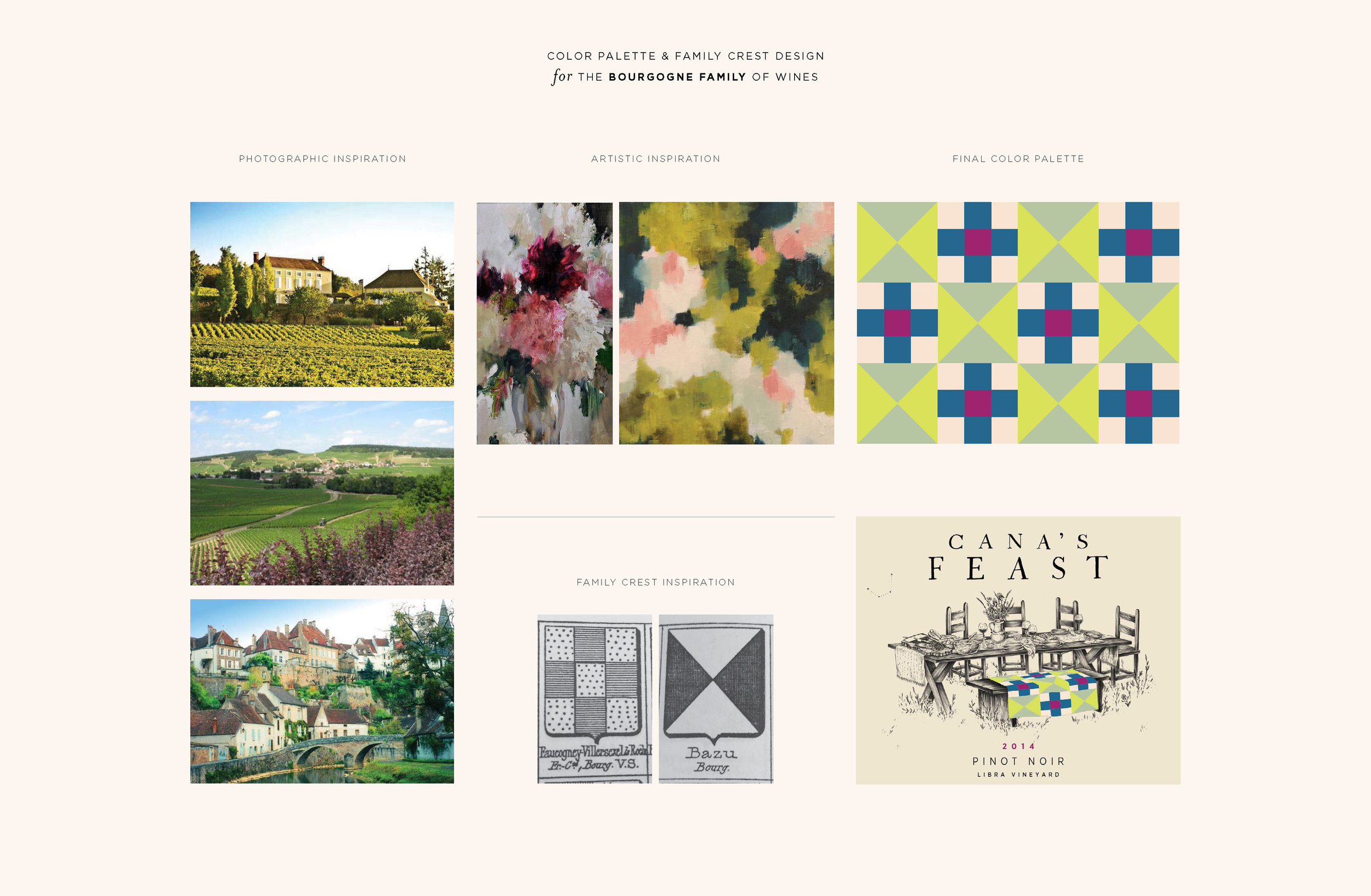
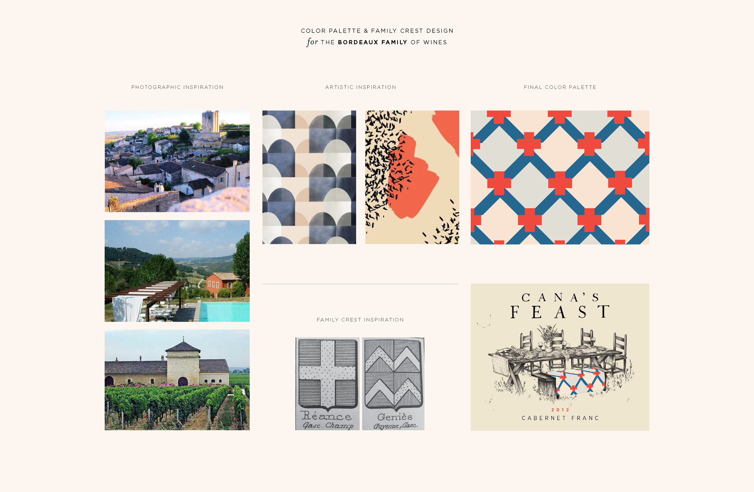
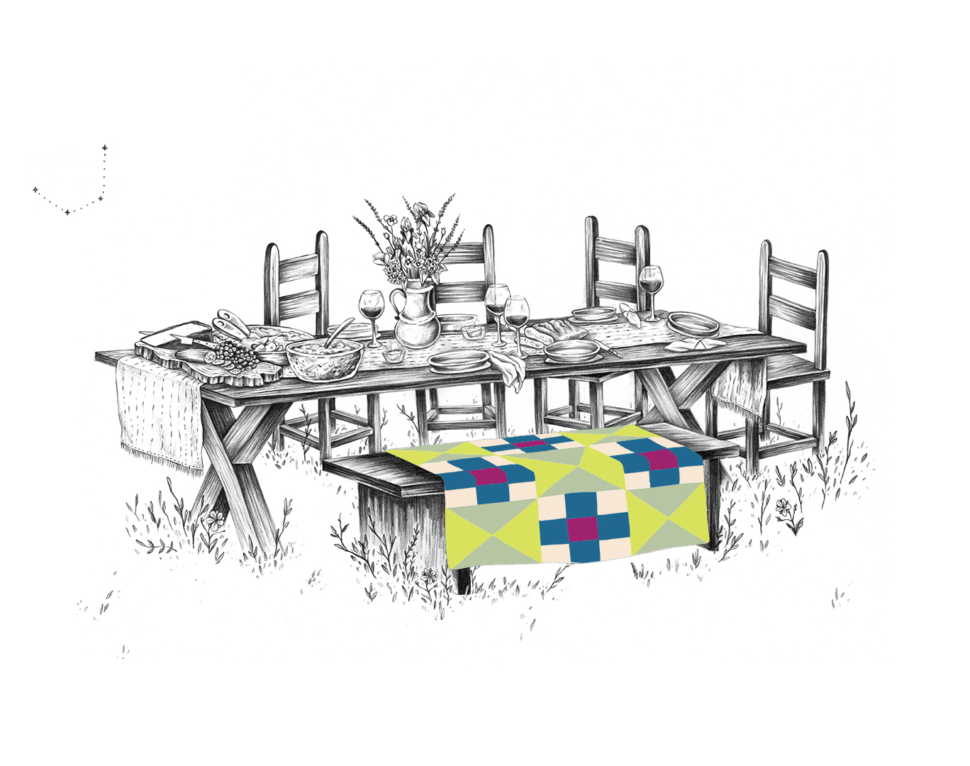
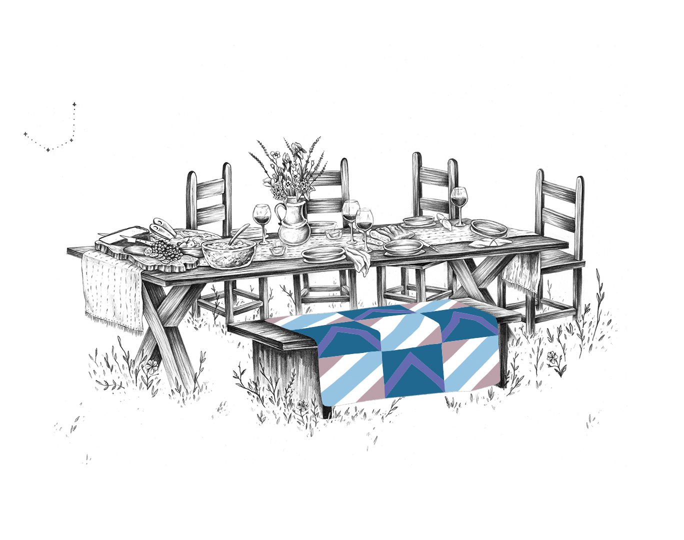
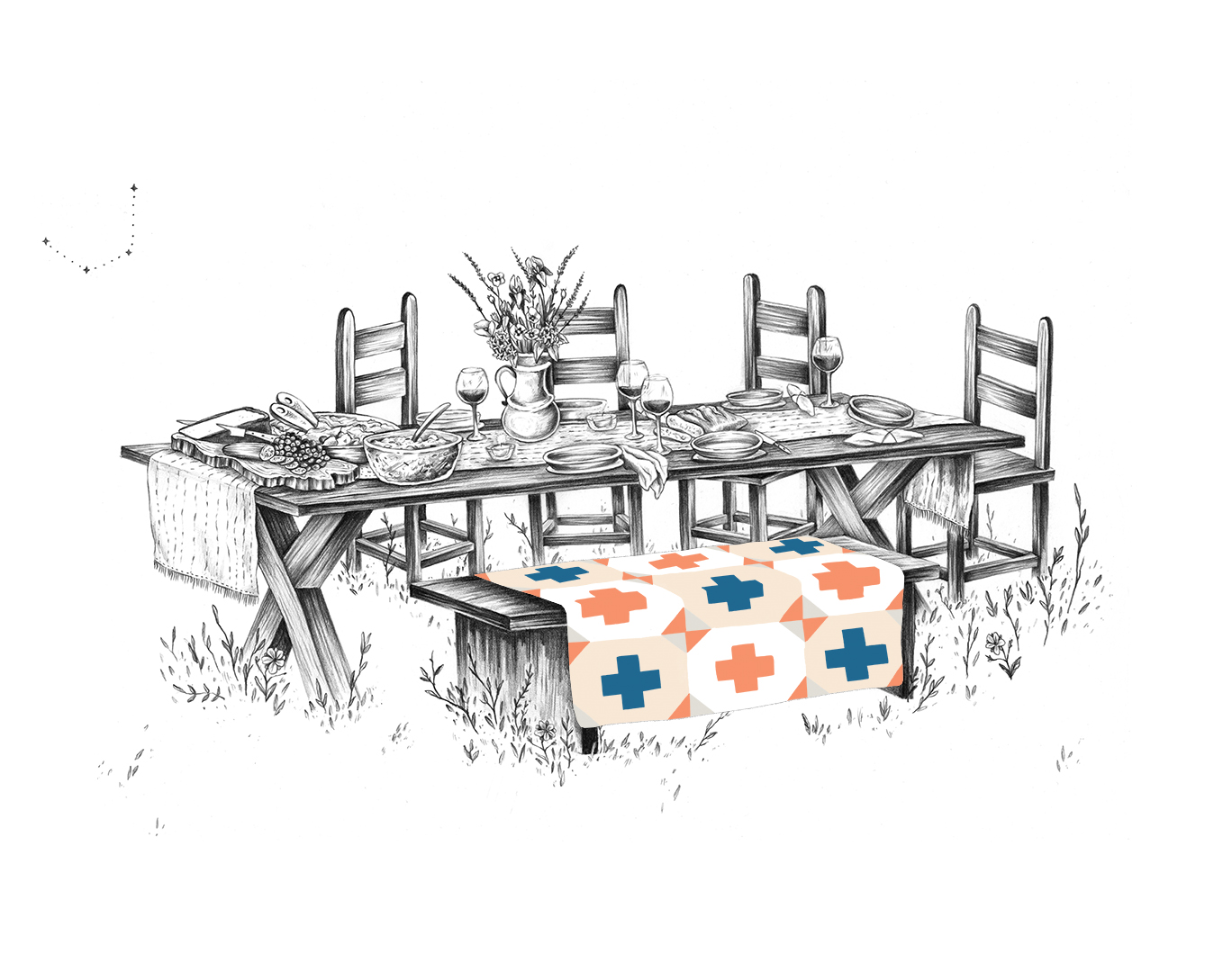
Inspiration: The Story of Color Palette and Blanket Design
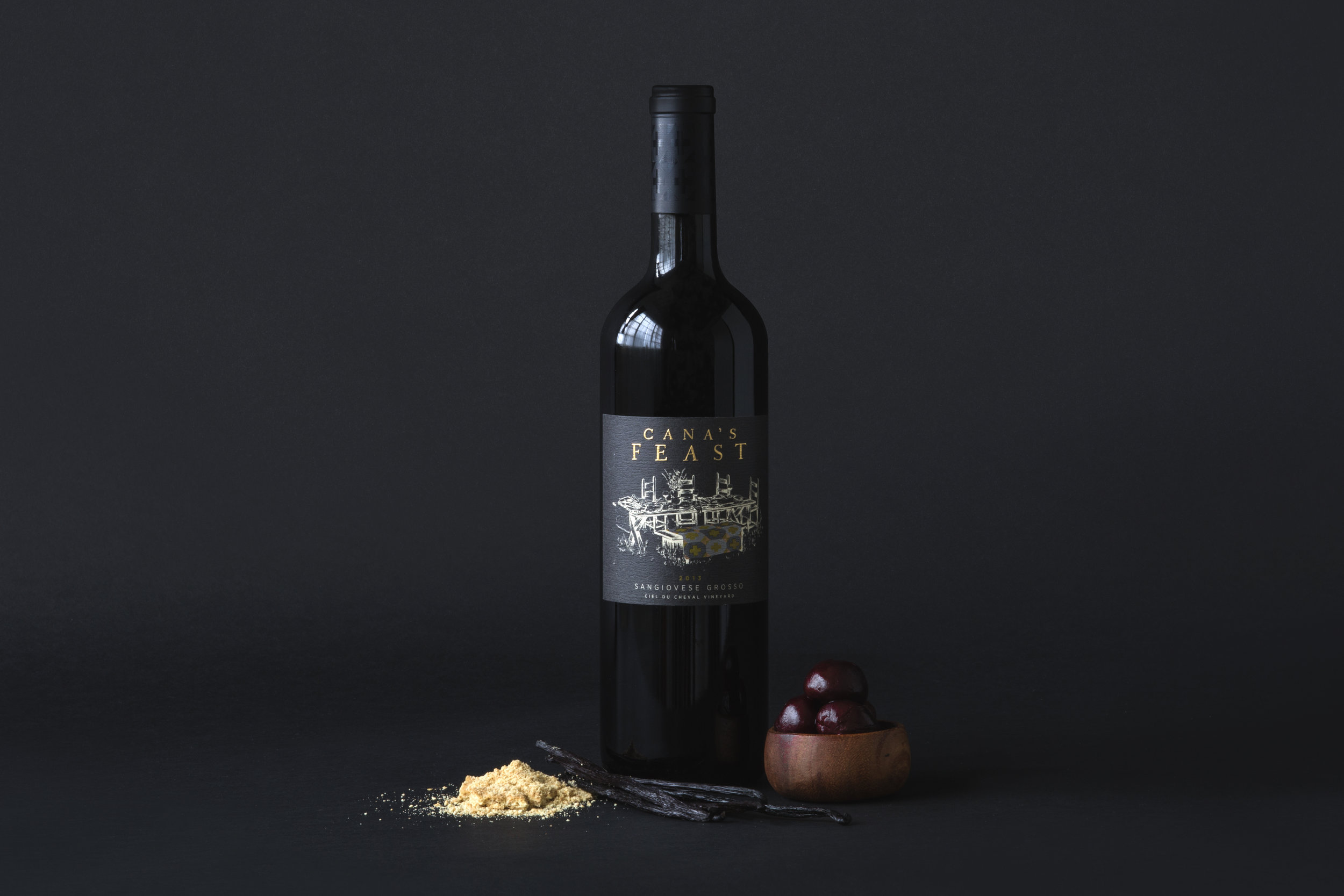
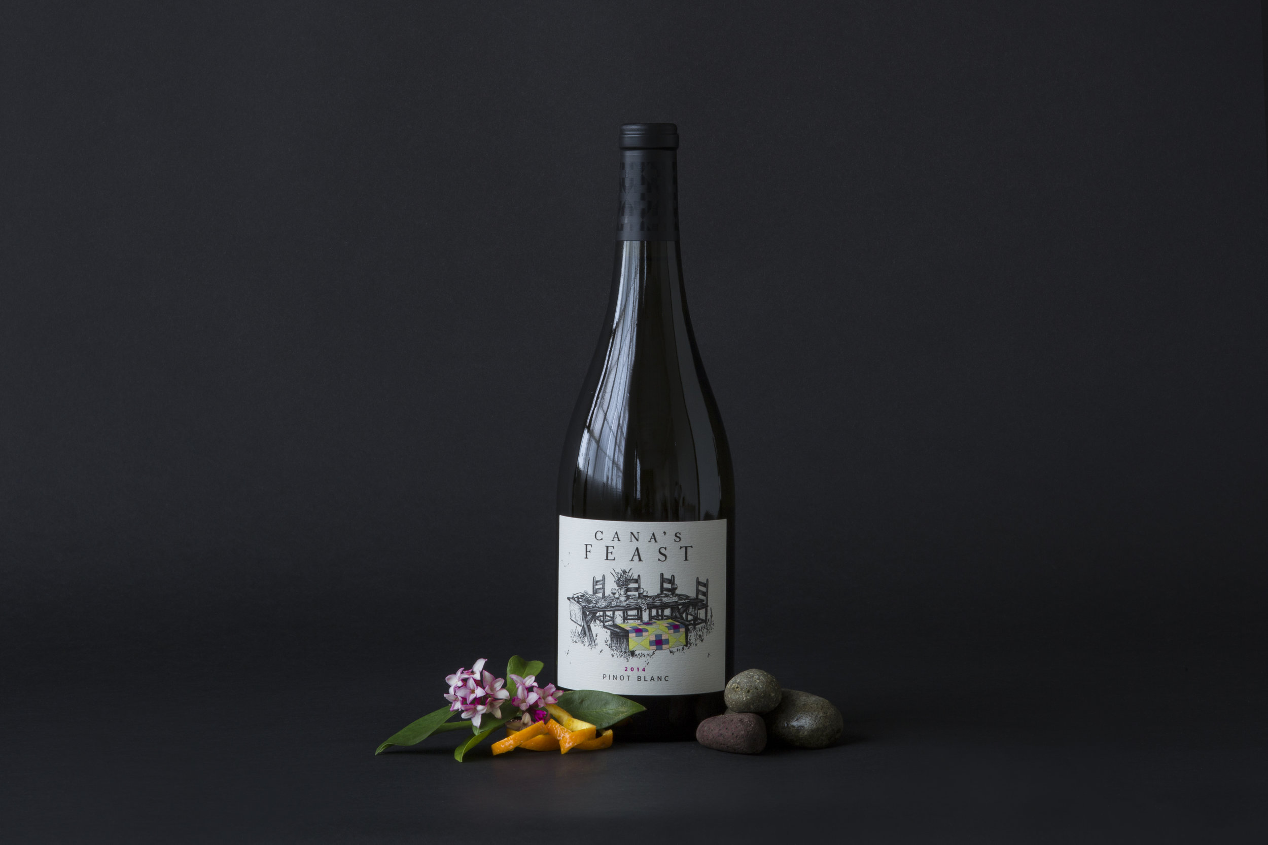
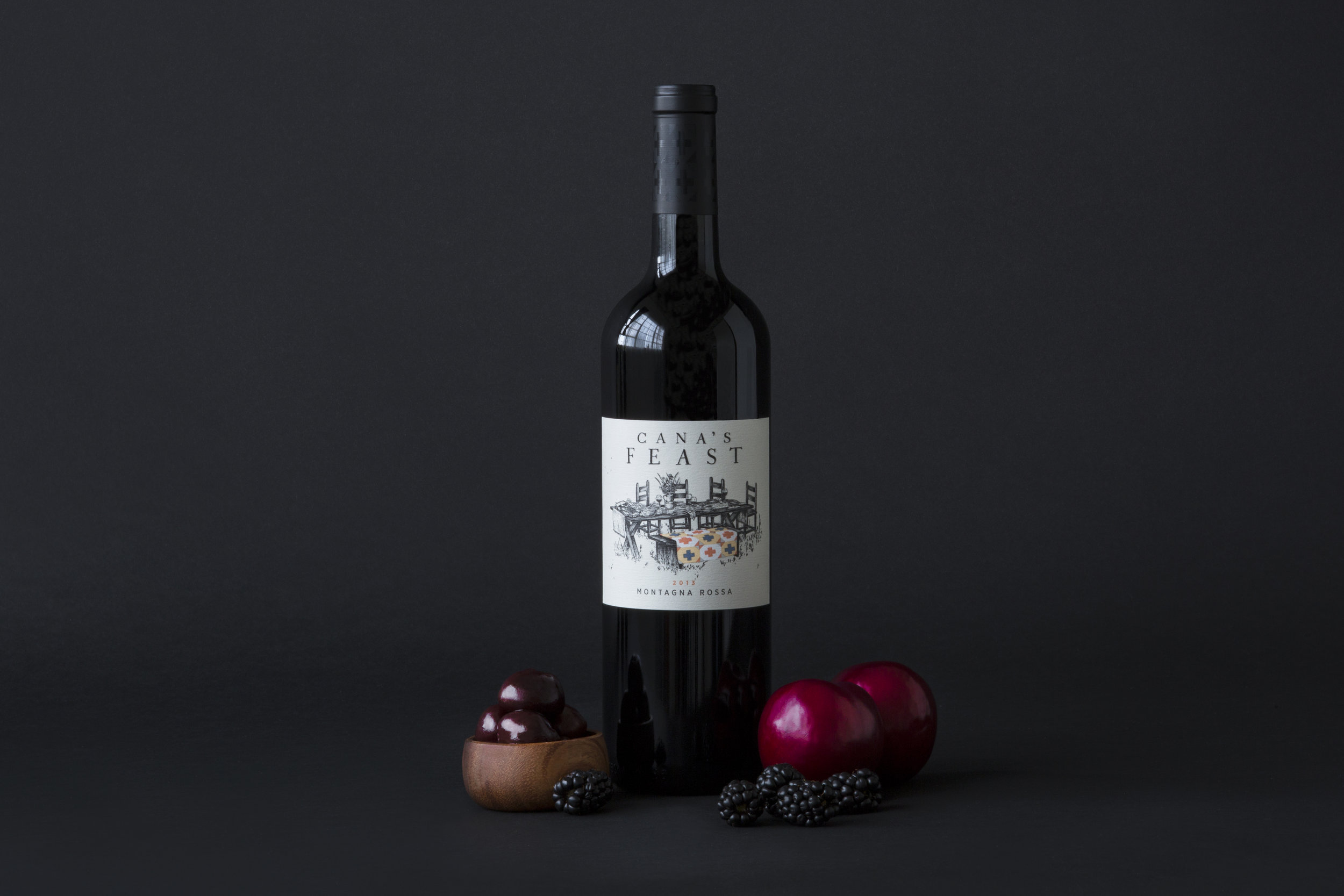
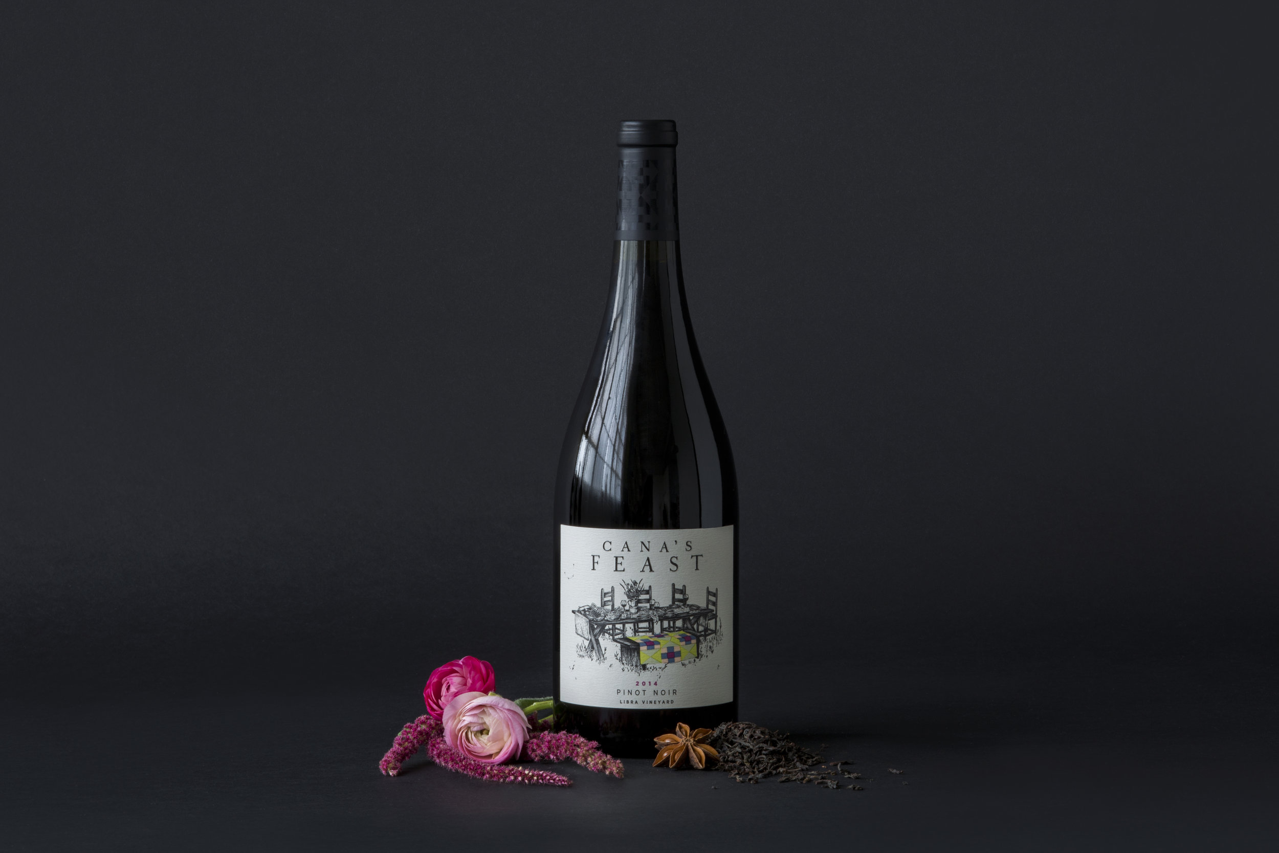
The etymology of the family blanket was born out of a love of heirloom quilts, handed down for generations. This familiar ritual among families all over the world, and here in the Pacific Northwest, helped established a visual language to implement the deep-seated European tradition of the family crest. With the guidance of a librarian well practiced in historical and regional crests, I selected elements with both aesthetic appeal and familial, regional significance, developing a unique pattern for each family of wine. Once this phase was completed, it was time to create color palettes that were grounded in regional reference while still supporting any auxiliary items (i.e. seasonal design collateral). I began by collecting beautiful, regionally focused photography, and paired that imagery with artwork that set the mood and fell in line with the naturally occurring environmental color palettes. From there it was a matter of establishing guidelines that would help inform a series of colors that would not be pigeon holed into any particular seasonal or meaningful associations, and that would stand both alone and as a series on the tasting floor. The outcome was an unexpected collection of hues that are both intriguing and easy on the eye.


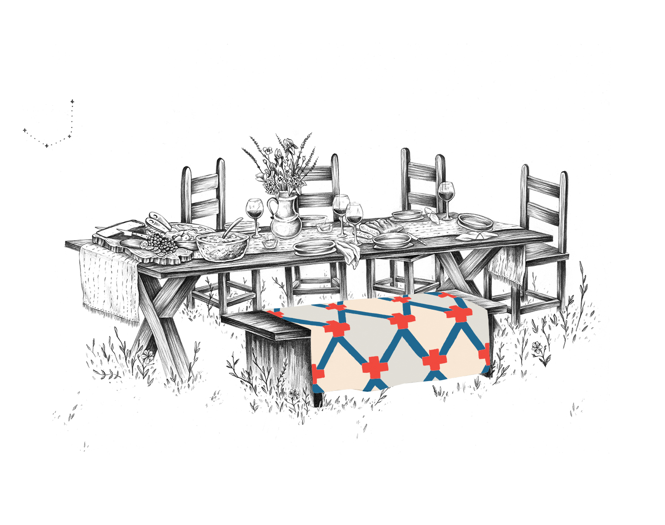
Hidden Stories:
Tucked within our family tables are points of discovery beyond the obvious blanket. Our constellation, named for Table Mountain, home to the Twelve Apostles mountain range. A wine jug (like one you might find in a depiction of the Feast at Cana) houses a bundle of blooms selected from each region for which the families are named. Iris (Bordeaux), red poppies (Bourgogne), rhododendron (Italy), and lavender (Rhone).


BRAND DESIGN
LOGo, typogrAPHY, BRAND GUIDELINES, front + back LABELs (system for 30+ varietals and blends), corks, capsules; Family/Blanket system: color palette + pattern design, family crest research; collateral design (templates for client): business cards, email promotional material, brochure, cellar club sign up, product sheets, menu; print pre-production for labels; Photo styling
CREATIVE DIRECTOR: ZAK DAVIS
Art Director: Ji Qutub
CALLIGRAPHY: PORTLAND PALOMINO
ILLUSTRATION: LAUREN GONSALVES
PHOTOGRAPHY: WILL MALZAHN
Agency: juliet zulu